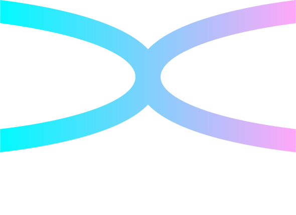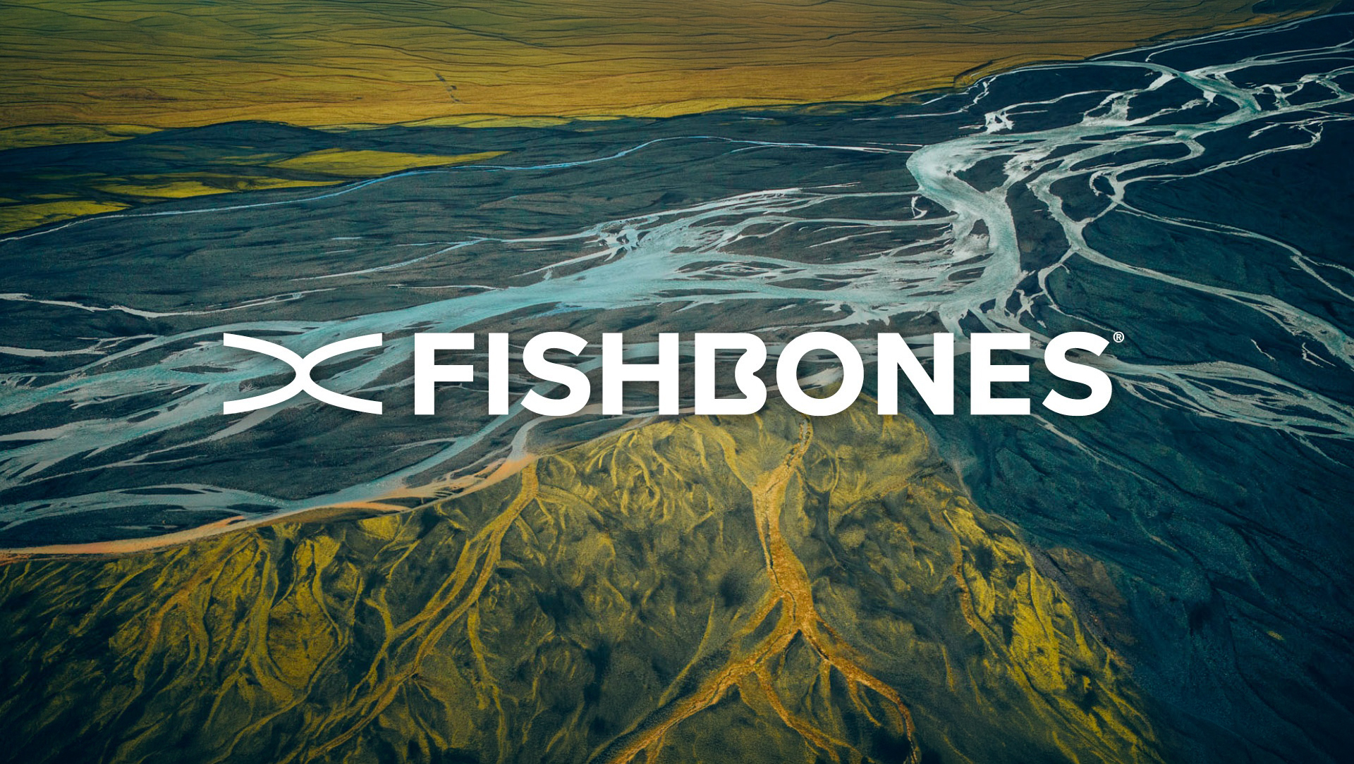

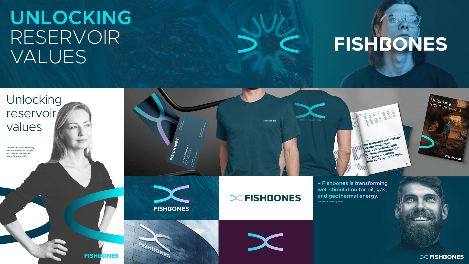
After being more than 15 years in business for more efficient well stimulation with proven results globally, the time was right to elevate the Fishbones brand. The result is a new visual identity that communicates more clearly who Fishbones is, and what the company stands for.
The profile has been developed in close collaboration with the branding agency Fabel, and includes a new logo, colour palette, typography, and a visual expression that scales well from digital platforms to major industry exhibitions.
“We wanted an identity that is as precise and targeted as our technology. The new profile makes it easier for customers, partners, and employees to understand both our position in the market and the direction we are heading,” says Eirik Renli, CEO of Fishbones.
Inspired by the Unique Technology
The new logo is inspired by the very core of Fishbones’ technology – many small, controlled “branches” that together create greater contact with the reservoir. The visual expression plays on structure, precision, and movement, and reflects how Fishbones creates value by unlocking more of the reservoir.
“Fishbones is a Norwegian technology story with global potential. Our task has been to distil that story into a clear, recognisable expression that works just as well on a PowerPoint slide as it does on a large exhibition wall in a hall full of world-leading energy companies,” says Nils Petter Wedege, Agency Director at Fabel.